Visualizing Logistic Regression
Application of coloring book technique in a reproducible ggplot2 system
Visualising results of statistical modeling is a key component of data science workflow. Statistical graphs are often the best means to explain and promote research findings. However, in order to find that one graph that tells the story worth sharing, we sometimes have to try out and sift through many data visualizations. How should we approach such a task? What can we do to make it easier from both production and evaluation perspectives?
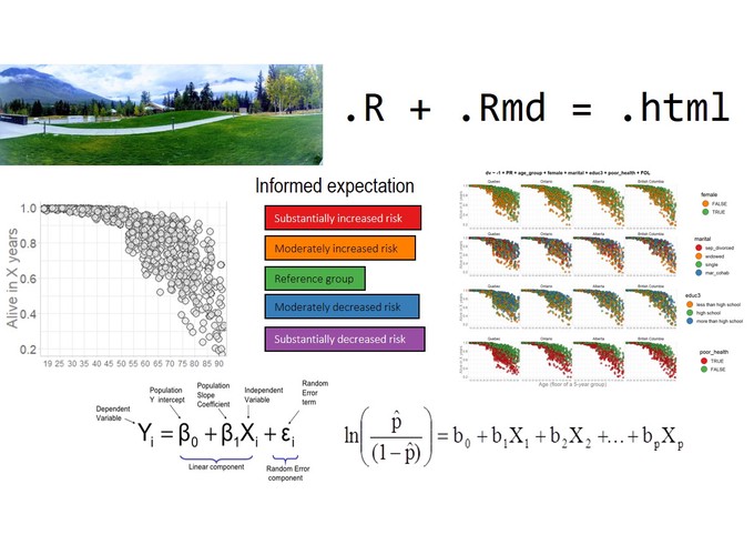
This presentation will demonstrate a reproducible graphing system designed for the IPDLN-2018 hackathon. The system evaluates synthetic socioeconomic and mortality data with logistic regression. The data was prepared for the hackathon by Statistic Canada and represents Canadian population.
Topics covered will include:
- Introduction to a visualisation technique that uses color to create meaningful expectations from the results of a logistic regression.
- Details related to the workflow of the project that implements this graphing system (github.com/andkov/ipdln-2018-hackathon )
- Building the case for preference of reproducible workflows with version control over computational notebooks (e.g. Jupyter, R Notebook).